Logo explorations
Seven generated studies, made to find a direction rather than to be used. They are raster images at 1024–1254 px, not artwork: the lettering in several of them is malformed or misspelt, and none of them is drawn as vector. What they settled is the subject — the Pharos of Alexandria, the lighthouse standing against the sea — and that is what was carried into the drawn identity at the bottom of this page. Click any study to open it full size.
The lighthouse seal
A ceremonial roundel — the form a college uses on a diploma, a letterhead or a mace, not on a website. Three studies, moving from a full engraved scene toward something that survives being printed small.

Everything at once: lighthouse, cross, open book, the three virtues, the lamp of learning, laurel and a founding date. The most ceremonial of the set and the most legible lettering of the seals.
- Ring lettering is correct and complete
- Too much detail to reduce — the scene fills in below about 40 mm
- Dated MMXXI, where the drawn seal carries MMXXVI — the founding year still has to be settled

The same seal with the scene stripped back to the tower, the rock and the rays. Two weights of ring, wide-tracked Roman capitals, gold used only in the light itself. The strongest candidate of the seals.
- Lettering correct; motto and name both read cleanly
- Engraved hatching still needs redrawing as flat vector

The same tower with the ring left empty — useful as a test of the emblem on its own, and as the shape the name would later be set into.
- No lettering, so nothing to correct
- The empty ring is very wide; the drawing sits small in its frame
The book and the lamp
An earlier line of studies on the conventional academic subjects — the open book and the flame of learning — before the lighthouse took over. Kept here for the record; the lettering in all three is unusable.
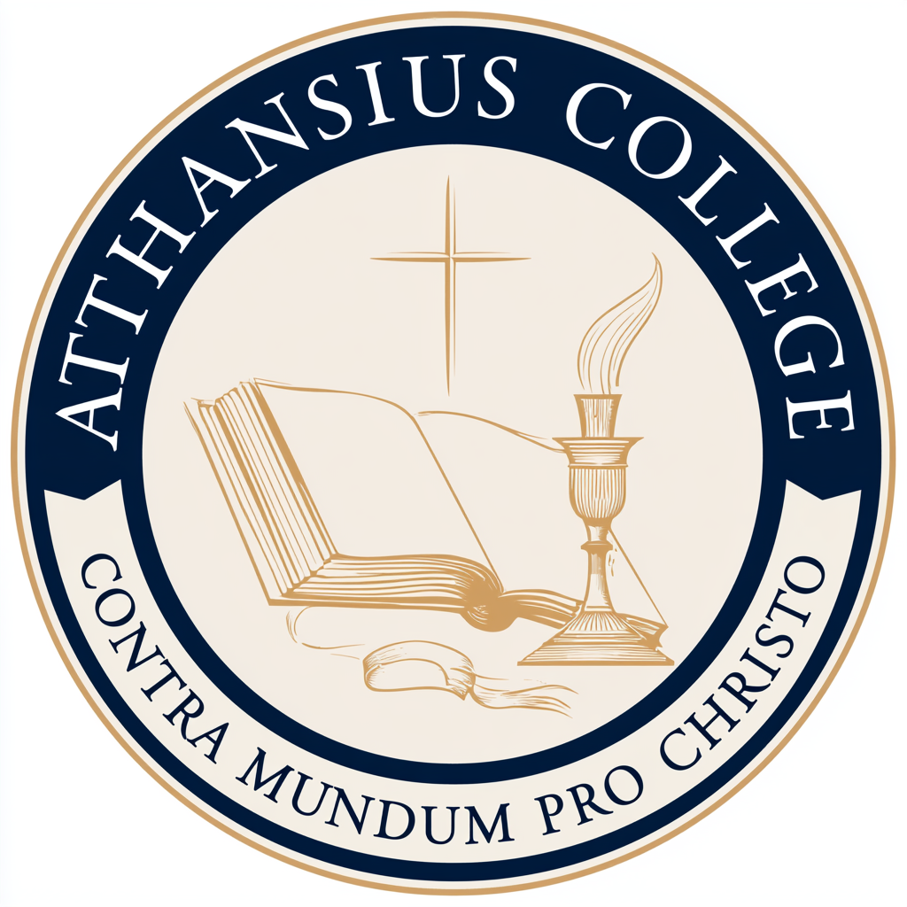
The most finished of the three: heavy navy band, gold line work on cream, the motto carried on a lighter band below. Close to a workable seal apart from the name.
- Reads “Athansius” — the name is misspelt
- Gold line work is too fine to hold at small sizes
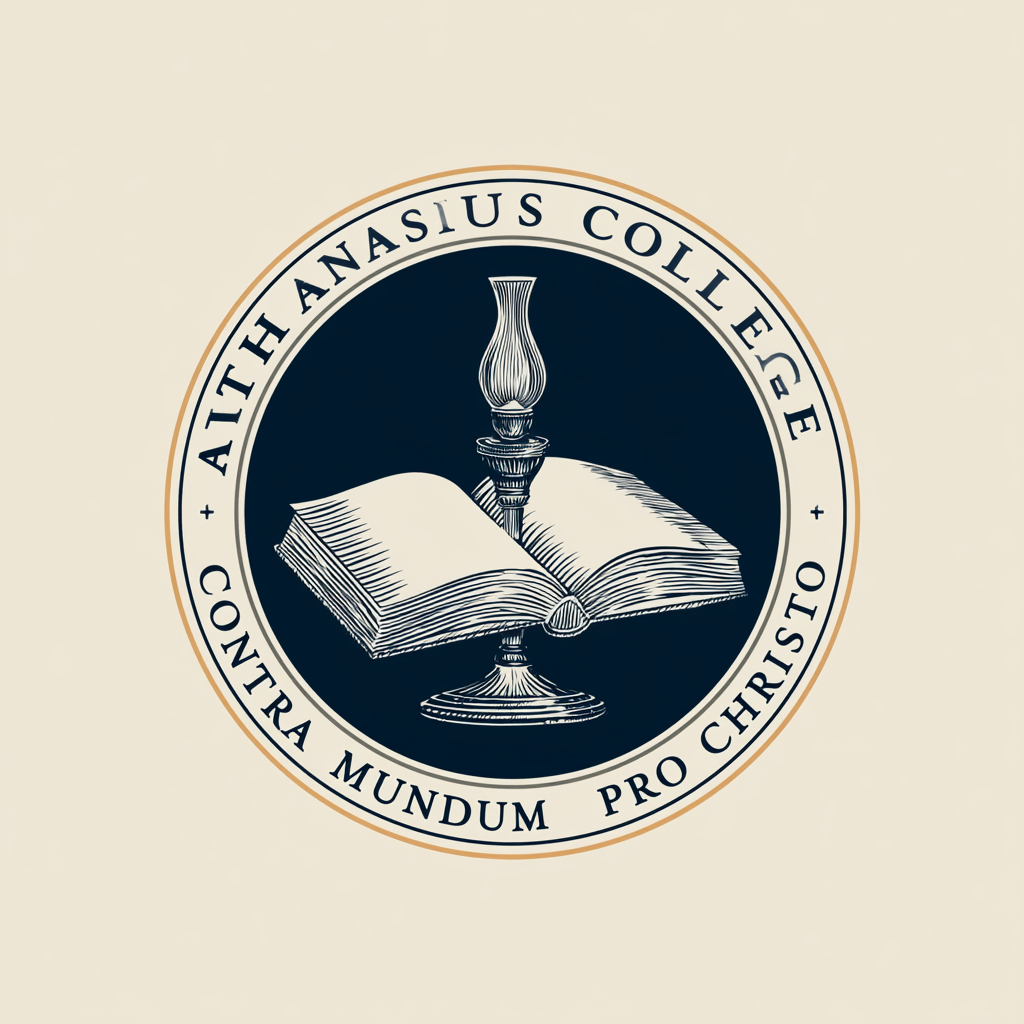
The one study that reverses the emblem out of a solid disc, with the lettering set on the cream ground outside it. The contrast is the most striking of the three.
- Lettering is broken — letterforms collide and drop out
- The lamp reads as a chess piece rather than a flame

The same subject on a navy ground with a gold ribbon carrying the motto. The ribbon is the one element here that none of the later directions kept.
- Lettering is broken and the name is unreadable
- Ribbon and disc crowd each other; the motto overlaps the base
The reductive mark
The one study that stopped drawing a lighthouse and started drawing a letter. This is the study the identity was built from.
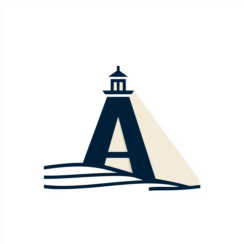
A capital A whose apex is the lantern room, a beam thrown across the square, and three lines for the sea. Flat, two colours, no hatching — the only study in the set that would survive being set at 16 px in a browser tab.
- Reduces cleanly; works in one colour
- The cast beam is asymmetric and unbalances the square
- No wordmark, no lockup, no ceremonial form
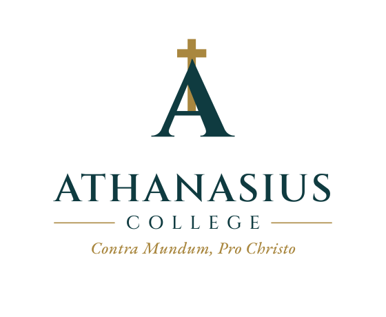
Redrawn as outlined vector, with the lantern room resolved into a cross and the beam dropped. This is the mark the brand guide defines and the one Option 05 is built on.
- Vector, with lockups, wordmark, seal and favicon drawn
- Clear-space and one-colour rules defined in the guide
Where this landed
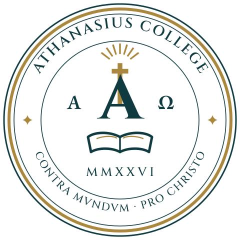
The generated studies are exploratory only. The identity that came out of them — the Beacon A, the wordmark, the horizontal and stacked lockups, the ceremonial seal and the favicon — is drawn as outlined vector and documented in the Brand Identity Guide, with clear-space, one-colour and misuse rules.
Option 05 of the website directions is built entirely from that guide: Gulf Petrol, Vermeil and Limestone, Cinzel and EB Garamond, and the mark in the header.